High-ticket industries like financial services, automotive, travel, and many B2Bs (including ourselves) rely heavily on content to guide potential customers through long and complex journey.
To optimise your content, you need to understand who views it and in what context. For instance:
Knowing how visitors arrived on a page adds even more context. For example, understanding which pay-per-click campaign brought them to your site reveals their intent, helping you tailor the content to meet their expectations.
Ultimately, content isn’t about individual pages—it’s about addressing customer needs and concerns. Grouping pages into categories based on customer needs can provide a more meaningful way to analyse performance, especially for larger websites.
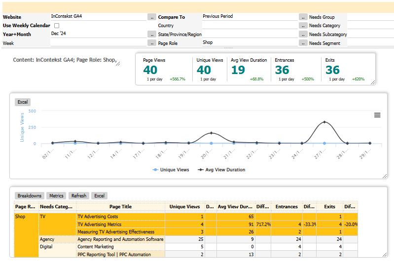
GA4’s standard reports don’t support this kind of analysis. The lack of contextual insights makes it frustrating to understand content performance using just page views or time-on-page metrics. That’s why we created an interactive content performance dashboard, which consolidates visitor journeys data around content categories.

With multiple filtering options at the top of the screen, the dashboard makes it easy to zero in on the area of interest. In the screenshot above, the dashboard displays data for the shop area of the site - a group of pages describing specific product. On the screenshot, the 3 pages related to TV (TV effectiveness measurement) are highlighted, showing the total of 8 unique views (i.e., excluding page refreshes)
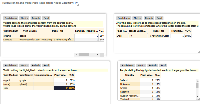
To view navigation to and from these pages, the user can highlight the area on screen and the dashboard will display the navigation information at the bottom of the dashboard screen.

Here you can quickly see that the visitors to these area come primarily from organic Google search, landing directly in one of the pages. If we had a paid campaign driving traffic to this area, the campaign names would have been dispayed in the table on the bottom left.
We can also see minimal engagement with this content as one visitor clicked through to "TV advertising cost" as shown in the top right table. Finally, the dashboard shows which countries these visitors come from - it turns out, it is all over the world.
If the user wants to see navigation to and from another area, all they need to do is highlight that area in the table above - the navigation area will be refreshed in a few seconds to reflect the new selection.